The Challenge: Creating a distinct brand identity for SONS & SONS, a South African law firm startup, posed the challenge of blending tradition and modernity while resonating with relatability. The brand's focus on relatability required a delicate balance between approachability and professionalism, all while representing the local roots and reliability of a law firm.
The Goal: The primary goal was to establish a brand identity that seamlessly merged the essence of South African legal heritage with a modern, relatable touch. The challenge was to design a logo and mockups that visually conveyed the reliability clients expect from a law firm, while also reflecting the relatability and resonance emphasized in the brand's slogan. The color palette of black, gold, and white needed to be harnessed effectively to evoke both sophistication and trustworthiness.
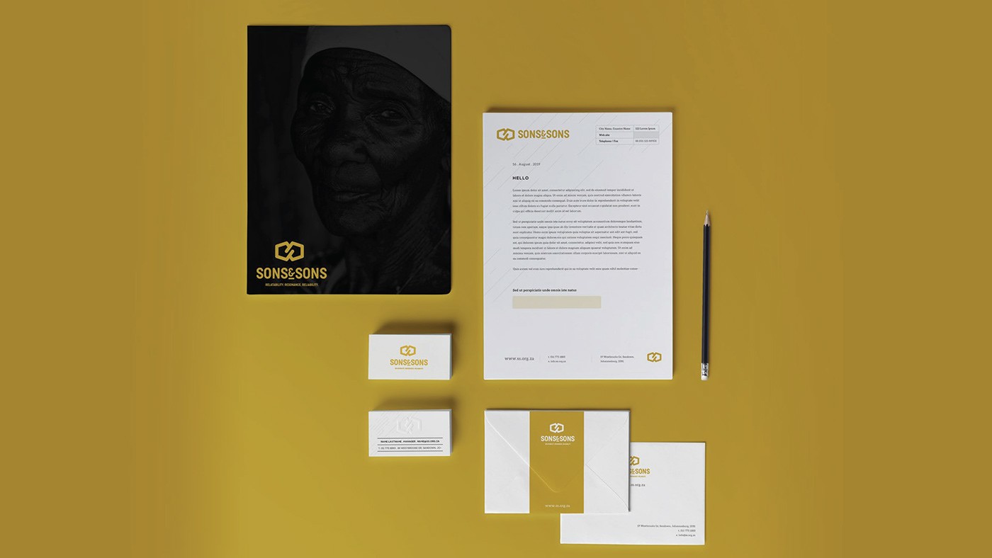
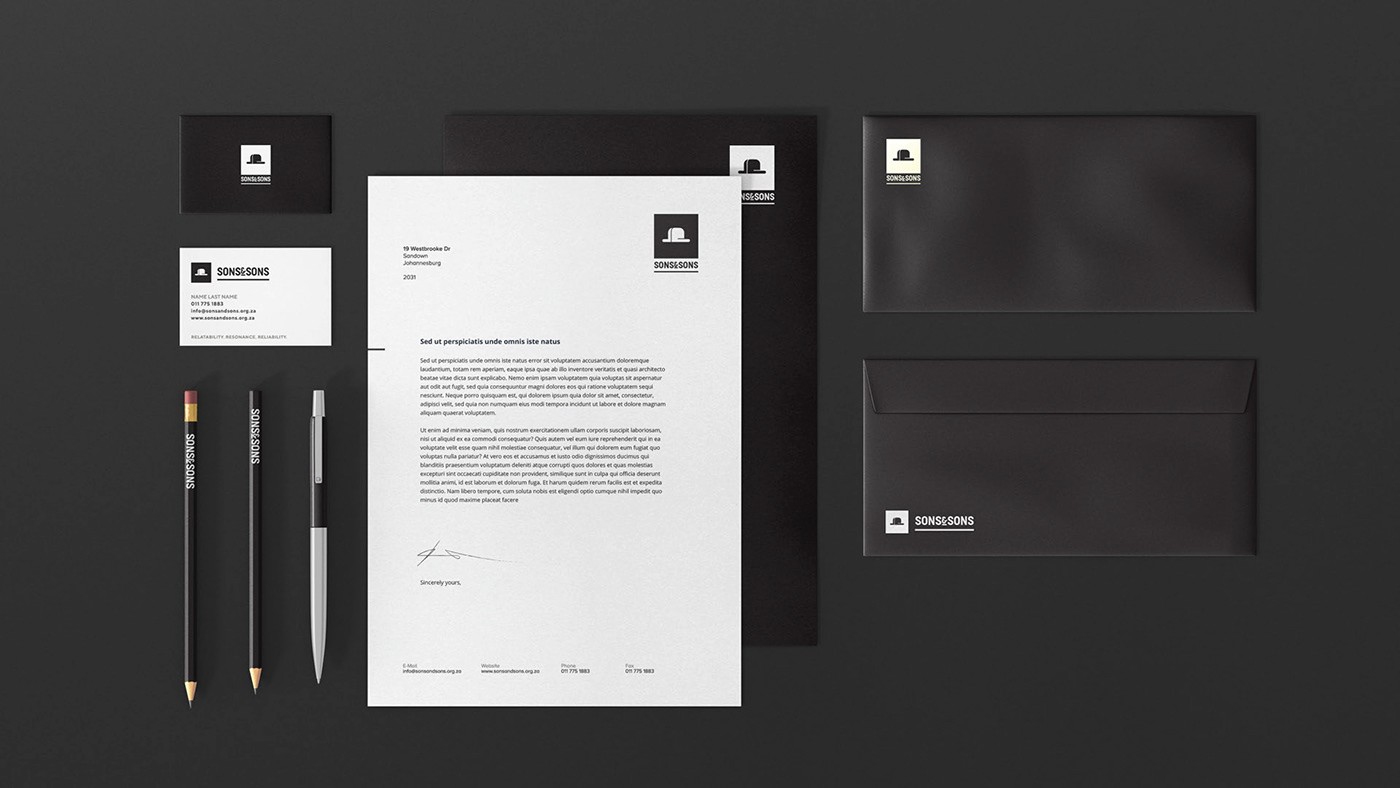
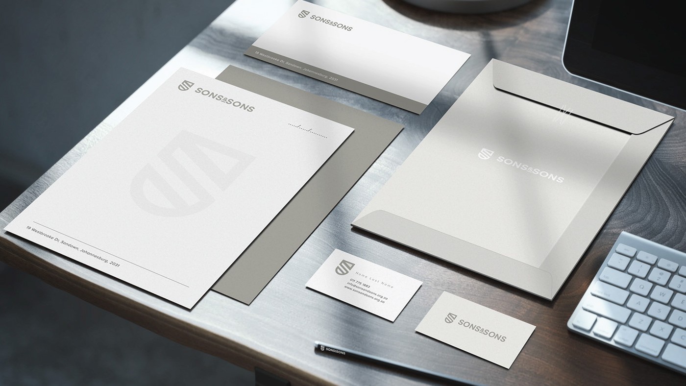
The Solution: To meet these goals, the design approach revolved around harmonizing classic elements with contemporary aesthetics. The logo blended bold typography with a touch of gold, symbolizing prestige and professionalism, while maintaining an open, approachable vibe. The mockups extended this visual language, showcasing a balance between traditional wood-paneled legal environments and a warm, inviting ambiance. The gold accents emphasized trust and reliability, while the relatable feel was embodied through personalized client interactions within the mockup scenes. The seamless union of classic and modern elements achieved an authentic brand identity that conveys SONS & SONS' commitment to relatability, resonance, and reliability in the context of a South African legal landscape.
The Challenge: Creating a distinct brand identity for SONS & SONS, a South African law firm startup, posed the challenge of blending tradition and modernity while resonating with relatability. The brand's focus on relatability required a delicate balance between approachability and professionalism, all while representing the local roots and reliability of a law firm.
The Goal: The primary goal was to establish a brand identity that seamlessly merged the essence of South African legal heritage with a modern, relatable touch. The challenge was to design a logo and mockups that visually conveyed the reliability clients expect from a law firm, while also reflecting the relatability and resonance emphasized in the brand's slogan. The color palette of black, gold, and white needed to be harnessed effectively to evoke both sophistication and trustworthiness.
The Solution: To meet these goals, the design approach revolved around harmonizing classic elements with contemporary aesthetics. The logo blended bold typography with a touch of gold, symbolizing prestige and professionalism, while maintaining an open, approachable vibe. The mockups extended this visual language, showcasing a balance between traditional wood-paneled legal environments and a warm, inviting ambiance. The gold accents emphasized trust and reliability, while the relatable feel was embodied through personalized client interactions within the mockup scenes. The seamless union of classic and modern elements achieved an authentic brand identity that conveys SONS & SONS' commitment to relatability, resonance, and reliability in the context of a South African legal landscape.


Your brand deserves the best. Let me help you achieve it with custom-designed graphics.
Available for work
Let's Work Together.
Your brand deserves the best. Let me help you achieve it with custom-designed graphics.
Available for work
Let's Work Together.
Your brand deserves the best. Let me help you achieve it with custom-designed graphics.
Available for work
Let's Work Together.